


.jpg)

The principles of design are a set of rules that designers can use to create visually appealing work. These rules aim to convey a message in the most organized and functional manner possible.
There has yet to be any real agreement in the design community on the fundamental principles of design. But the seven design principles and design principles examples listed below are the most frequently mentioned in articles and books on the subject.
1. Principles of Design: Contrast
Contrast is the degree of difference between design elements and is used to create visual hierarchies that enable certain elements to stand out more than others. Colors, textures, sizes, and shapes can all be used to create contrast.

You can use contrast in layouts to create a hierarchy between font sizes, as larger text is always read first, followed by smaller text.
Font pairing is another area where you can use contrast. For instance, pairing a script font and a sans serif font creates contrast as the script font adds movement to the otherwise static sans serif font.

Contrast also has another interesting application; it can be used to create a focal point and direct the viewer’s attention to specific elements. In the design below, the circle is the focal point of the design.

Apple’s product packaging often uses high contrast between the product and the background. For instance, their white packaging with a bold logo creates a stark contrast that highlights the simplicity and elegance of the product. This approach helps in creating a focal point and directs attention to the product itself.
2. Principles of Design: Balance
Every element on a page has a visual weight that can vary in shape, size, color, and texture. They must be of a particular scale for the design to feel stable or balanced. In the absence of balance, your design will appear heavy on one side and empty on the other. There are two types of designs you can achieve based on the balance you create, namely:
- Symmetrical design: Here, the elements on the right have the same visual weight as those on the left. Symmetrical designs are easier to balance, but they can also appear dull.
- Asymmetrical designs: These designs have opposing sides with the same visual weight. Achieving balance in asymmetric design can result in a visually appealing design with movement.

Oatly’s cartons exhibit a balanced design with a minimalist approach. The use of clean lines and consistent typography ensures that the visual weight is evenly distributed, creating an attractive and user-friendly package that reinforces the brand’s eco-friendly image.

3. Principles of Design: Unity
Unity refers to the arrangement of all design elements on a page such that they look harmonious. If your design lacks unity, it will appear cluttered and confused. Viewers will be drawn to the incorrect design element and will not receive a clear message.
You can establish clear relationships between elements or use similar colors that match to achieve unity and ensure that it doesn’t look like all the elements on a page are competing for attention.
For instance, you can use similar colors and integrate elements organically to create a unified design. However, the only caveat is that too much unity can lead to a sterile design devoid of personality. At that point, you can begin incorporating other elements to add movement.

Glossier’s skincare packaging demonstrates unity through its consistent use of minimalist design and soft pastel colors. Each product in the line maintains a cohesive look that reflects the brand’s identity and appeals to its target audience.

4. Principles of Design: Emphasis
Emphasis is a technique for drawing the viewer’s attention to a specific design element. This could be a button, a website, an image, or something that stands out from the rest of the page.
You can use lines, color, positive/negative relationships, and other elements to highlight a specific part of your design. Let’s take a look at them in detail:
- Lines help the viewer’s eyes know where to go on a page by pointing to specific elements.
- Shapes can also catch the eye. Using a group of similar shapes and breaking them up with different shapes creates tension and draws attention.
- Color can add emphasis to any design. For instance, a color contrast between the buttons on the website and a background is an example of emphasis.
- Texture can be seen in materials to improve tactile properties. A business card, for example, can have an emboss or relief on a logo to emphasize it. Texture can also be applied digitally as a drop shadow on a button to make it appear three-dimensional.
- Space can also be used to highlight specific elements in your design. Enough white space around an object can help to focus attention on a single element. Apple’s packaging design is the best example, as it uses copious amounts of white space to draw attention to the logo and the product.

Nike’s swoosh logo is a prime example of emphasis. The logo is prominent and easily recognizable due to its simple, bold design and strategic placement on products. The emphasis on the swoosh highlights the brand’s identity and adds a powerful visual impact.
5. Principles of Design: Repetition
Repetition is the process of repeating certain elements in the design to make it pleasing for the viewers. The most common example of this design principle is a grid, as it’s a repetition of lines.
You can also create repetition in your projects using a logo, tagline, or other shapes. For example, the repetition of waves on the page below gives the feeling that the page is endless.

Toblerone’s packaging is an example of repetition with its unique triangular bar shape and repetitive mountain graphic. This distinctive pattern creates a memorable brand identity and maintains visual consistency across its product range.
6. Principles of Design: Pattern
A pattern is the repetition of more than one design element in design principles. While repetition focuses on the repetition of a single element, pattern refers to multiple elements repeated throughout a design (e.g. wallpapers and backgrounds).
The use of patterns can improve the viewer’s experience and the appearance of a final design.
In the example below, the pattern comprises multiple elements of varying sizes and depths and repeats itself from edge to edge with no interruptions.

Burberry’s iconic check pattern is a classic example of using patterns to enhance brand identity. The repeated pattern across clothing and accessories creates a distinctive and cohesive look that is instantly associated with the brand.

7. Principles of Design: Rhythm
Rhythm is the use of repetition and pattern to create a feeling of organized movement in a design.

Designers can create five basic types of visual rhythms: random, regular, alternating, flowing, and progressive.
- Random rhythms have no discernible pattern.
- Regular rhythms always have the same spacing between each element.
- Alternating rhythms follow a consistent pattern that repeats, but the actual elements vary (such as a 1-2-3-1-2-3 pattern).
- Flowing rhythms follow bends and curves in the same way that sand dunes undulate and waves flow.
- Progressive rhythms evolve over time, with each iteration adding to the previous iterations.
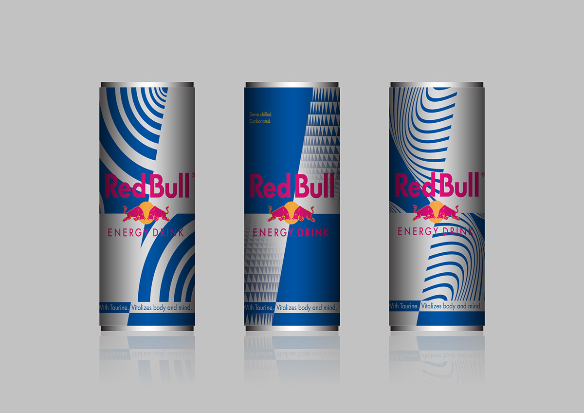
Red Bull’s can design employs rhythmic patterns with repeated elements like the diagonal lines and the logo placement. The dynamic design creates a sense of movement and energy, which aligns with the brand’s active and energetic image.

Wrapping up
Both seasoned and newbie designers must follow elements of design and elements of design examples to ensure that their design draws attention to the right elements and is balanced.
About Artwork Flow:
Artwork Flow is a creative collaboration and brand asset management software that helps you collaborate seamlessly and simplify the creative process.
To learn more about how it can help you, check out our case studies or contact us for a free demo.
.jpg)
.jpg)
.jpg)


