


Let’s face it: the artwork review process can feel like a never-ending loop. One version goes out. Feedback trickles in. Another version comes back. Someone updates the legal copy. Someone else tweaks the logo. Before you know it, you’re juggling five different files, wondering what actually changed between "final_v4" and "final_v4_updated2".
In regulated industries like food, pharmaceuticals, cosmetics, and personal care, this isn’t just frustrating, it’s risky. A missed update could mean non-compliance, delayed launches, or even a product recall.
That’s why smart version comparison isn’t just a convenience. It’s become a critical part of modern packaging workflows.
What is version comparison?
At its core, version comparison allows users to compare two different versions of artwork files to quickly spot what has changed. This includes everything from minor visual tweaks and color adjustments to critical copy updates like allergen declarations or legal disclaimers.
Whether you’re choosing an artwork version from your desktop, pulling it from a library, or selecting a previous iteration stored in your platform's version control, the ability to visually line up and evaluate changes saves a significant amount of time and confusion.
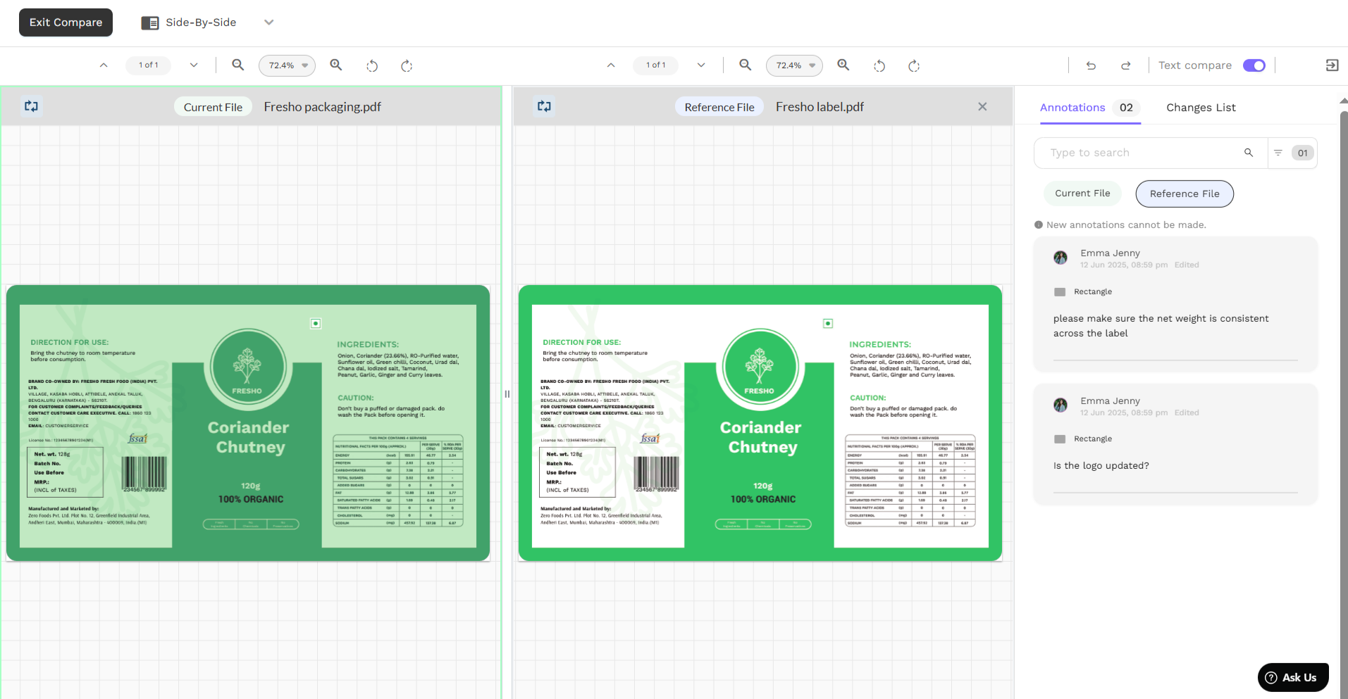
Most artwork management platforms today offer this feature, but the level of functionality varies. In Artwork Flow, for instance, there are three intuitive modes for version comparison:
- Side by side: See both versions next to each other for quick visual checks.
- Difference mode: Highlights only the parts that have changed, helping reviewers zoom in on exactly what matters.

- Flicker mode: Rapidly alternates between versions to reveal even subtle differences that might be missed in static views.

This isn’t just about design fidelity. It’s about eliminating guesswork. When teams can instantly see what’s been added, removed, or missed, they’re not only faster, they’re more accurate.
How does it help with regulatory approvals?
In highly regulated sectors, packaging artwork must comply with strict regional and global requirements. Every word, icon, and claim on a label can have legal implications.
In 2024, labeling errors were the leading cause of food recalls in the U.S., accounting for over 45% of all cases and costing the industry nearly $2 billion. A significant portion of these errors can be traced back to poor version control such as missed updates, outdated files, or misaligned artwork. It’s a preventable problem, and one that smart artwork comparison tools are built to solve.
Version comparison acts as a safeguard. Instead of relying on memory, manual notes, or side emails, reviewers have a single visual reference for confirming:
- Has the allergen warning been added?
- Did the net weight get updated across all variants?
- Were new ingredients listed correctly?
When the pressure is on to meet deadlines and avoid compliance setbacks, having a clear visual of what changed cuts the artwork review time significantly.
"With Artwork Flow, work is done in a more efficient manner. Our most loved and used feature is the comparison tool, through which we compare all artworks with the main artwork."
— Akshay Sehgal, Senior Marketing Executive, KRBL Limited
Version comparison in real packaging workflows
.jpg)
Let’s break it down. Here’s how different teams use version comparison across the packaging lifecycle:
1. Design teams:
Catch layout issues instantly. If a barcode was nudged or a panel misaligned, flicker mode reveals it in seconds. No more zooming into layers manually.
2. Regulatory teams:
Validate legal and compliance text without scouring two documents. Difference mode highlights exactly what was edited.
3. Marketing and brand teams:
Ensure visual consistency across product lines. When rolling out seasonal packaging or global SKUs, subtle brand elements like logo positioning or tagline usage can be monitored efficiently.
"By using Artwork Flow's proofing tools, teams can speed up reviews with the comparison feature, which helps identify differences between the latest and previous versions."
— Endah Sulistyowati, PID Project Manager, ParagonCorp
The ROI of clarity
The ROI here isn’t abstract. It’s measurable:
- Faster reviews: Teams using Artwork Flow report a 50-80% reduction in review time.
- Fewer errors: Brands using real-time comparison tools have reported up to a 60% reduction in artwork errors, significantly lowering rework costs.
- Smoother audits: Every change is recorded and traceable, which helps during regulatory inspections.
"I specifically love the ability to compare designs to previous versions. This really reduces our pain point of rework. As a smaller company, we’re focused on finding efficiency. The reduction in emails, artwork versions, and having it all in one place has been extremely beneficial to our company."
— Lisa Caras, Marketing Manager, Jones Dairy Farm
No more guesswork
Version comparison transforms how packaging teams work. It empowers teams to make confident decisions, reduce friction, and speed up regulatory reviews without cutting corners.
In an era where packaging accuracy is under the spotlight, having a system that helps teams move faster without sacrificing compliance isn’t just nice to have. It’s essential.
If your workflow still includes scrolling through PDFs or dragging files into Photoshop to compare edits, it might be time to ask:
What are you missing?
Version comparison isn’t just about spotting artwork differences. It’s about seeing clearly, acting faster, and never second-guessing a change again.


