


.jpg)

Icons are small drawings which help us navigate, find things, and make decisions. We’ve been using them from prehistoric times — the cave drawings and hieroglyphs early humans used are examples of icons.
And today, they’re even more commonplace; we see them in streets, malls, airports, and, of course, the internet world.
It makes sense that these computer symbols are an essential component of any design system or product experience as they can convey a complicated message in just a few seconds.
Few people enjoy creating icons, and even fewer are skilled at them. This article aims to teach you how to develop an amazing icon collection and what makes one stand out, whether you are a designer looking to branch out into icon creation or require a collection of icons for your website or product.
Fundamentals of icon design
You should know the technical specifications for icon design before making your own, whether you’re a designer or hiring one. So, let’s start by going over the fundamentals.
Size
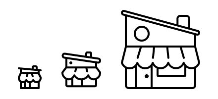
When it comes to icon design, consistency is essential. So, you first need to determine whether your grid size is a multiple of 8 or 10, as it’ll determine your icons’ size.
If you choose the 8-point grid, your icons should be 24x24 or 32x32 pixels in size because the size must be divisible by the number of grid points.
Additionally, you should always align shapes, especially straight lines, to the pixel grid while creating icons because it makes spacing simpler.
Tip: Pick a standard size for all of your icons. Making them suitable for the grid is still necessary, even if you wish to have separate, larger sizes for marketing and product icons. For instance, your design icon can be 80x80px and your logo icon can be 24x24px.
Colors
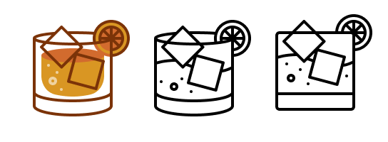
To enhance the overall aesthetic of your website or product, you may use several color versions of your icons. But to start, you should create them in a single color (ideally black), so you can alter them easily to match the design.
And even if you’re using multiple colors, ensure that you’re not using more than 3 colors as it would become an illustration and be too complicated and difficult to apply to your design.
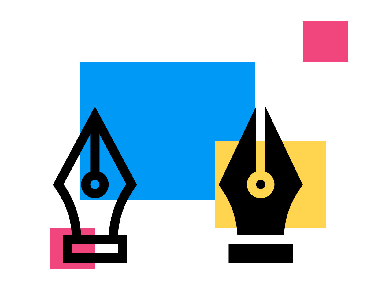
Strokes and fills
You can choose between a stroke-based or fill-based icon set to maintain the uniformity of your icons.
When designing icons for products, it’s best to choose icons made with fills as they’re easier for customers to scan.
But if you’re creating an icon with strokes, use the same stroke weights throughout the design and ensure the space between two strokes is bigger than its weight.
Grids
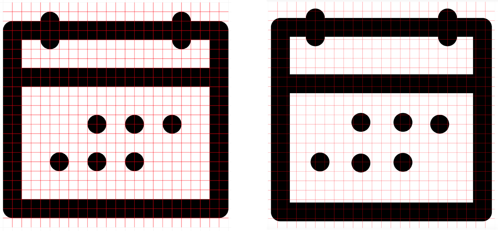
There are many types of grids, but when working with icons, you’ll primarily use a pixel grid.
A pixel grid is a basic grid that employs a pixel as the lowest increment. When creating icons, you should always align all elements, particularly straight lines, with the pixel grid.
Not only will it render the icon more attractively, but using the pixel grid will also make your workflow simpler, making it much simpler to space things evenly.
Overall, your icons will look better due to maintaining consistency with your placement. Here’s a simple difference between anything being “on-pixel” and off.
Icon design principles
Here are some crucial factors to learn if you want to know how to make an icon.
Balance and composition
To develop the forms of your icons, start with simple shapes like rectangles, squares, and circles, unless the design is highly organic and natural.
If you need to create intricate polygons when sketching geometric shapes, you can either begin with a square or rectangle or use the pen tool to go from point to point within a pixel. But ensure you have a clean grid when doing this so you can see where those points are heading.
Cohesion
When you design an icon set, you want them to work together. So, decide on the overall look, and ensure that any new icons you later add to the collection adhere to that look.
One way to do this is to make your iconography comply with your brand identity. Because your icons are consistent, your target audience won't be confused by their meaning and will intuitively grasp what they represent.
Metaphors
When creating icons, it’s always great to use metaphors in your scheme. You can always get creative with pre-existing or universal symbols for specific content to match the voice and tone of your firm.
An excellent illustration of metaphors being used in iconography is the birdhouse that serves as Twitter's "home" button.
Abstraction
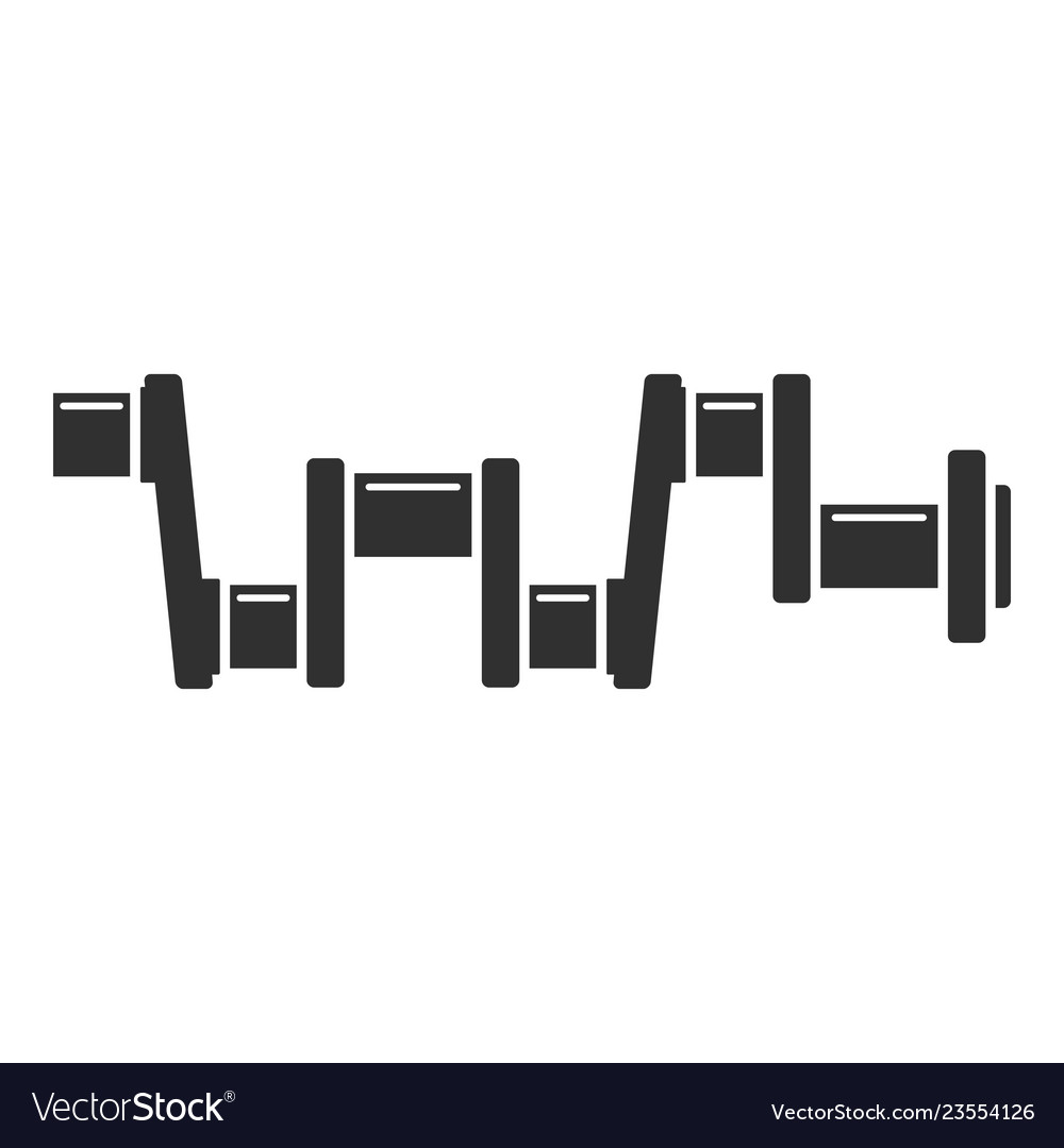
While some topics are simple to illustrate, others are challenging. When it comes to the latter, designers frequently use abstract iconography that can convey meaning through their shapes and colors.
For example, if a designer wants to represent an engine crankshaft, they can use an icon similar to the one shown below.
Important Boolean operations to know while designing icons
Any set of shape layers can be combined using Boolean operations to form icons using one of four formulas: union, subtract, intersect, and exclude. This tool is a great way to make your icons more editable. Here are some of the most common Boolean tools you’ll use in your design:
- Union: Union creates a Boolean group by combining the chosen shapes. If the objects overlap, the new shape’s outer route comprises the paths of all of its sublayers minus any overlapped segments. So, the stroke would be applied to the outer route, ignoring any path segments that overlapped.
- Subtract: Subtract is the opposite of union. To create a shape using subtract, the area of the shapes is subtracted from a base shape.
- Intersect: Intersect creates shapes from the overlapping parts of its base shapes.
- Exclude: Exclude is the opposite of the Intersect tool. It only displays the portions of sublayers that do not overlap with each other.
Wrapping up
Icons should be straightforward, simple to understand, and appropriate. So, ensure that the icon set you select complements your brand identity, regardless of the style or color you decide to use. This will ensure that your brand stands out from the competition.
Last but not least, it's okay to follow the rules, but don't be afraid to use your imagination and be creative, even if that means breaking a few regulations in the process.
Tip: To ensure that your icons are consistent in color and size, you can use Artwork Flow’s color extractor and online scale.
About Artwork Flow:
Artwork Flow is a workflow automation software & brand asset management software specifically designed for design and marketing teams.
It helps simplify your creative process by enabling you to collaborate with your team from anywhere, secure your assets, and manage your project end-to-end.
To learn more about how it can help you, check out our case studies or contact us for a free demo.
.jpg)

.jpg)
.jpg)


