


Proofing your labels before they’re printed maintains your brand’s credibility and prevents you from facing recalls and fines due to misprints.
But many brands don’t know what to look for when proofing their labels, and it costs them heavily in terms of brand reputation.
That’s why we’ve created a guide that lists common proofing mistakes you should look out for in your product labels and how you can avoid them.
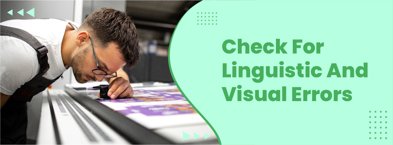
1. Check For linguistic And visual errors
You'll need to do two types of proofreading before sending your labels to the printers.
- Linguistic proofreading: Checking for grammatical mistakes, typos, and overall flow comes under linguistic proofreading.
- Visual proofreading: helps weed out errors that offset the visual balance and make the label appear too crowded.
Linguistic Proofreading
A London-based agency surveyed more than 1000 consumers and found that 42.5% of consumers would be discouraged from purchasing if there were spelling mistakes on marketing materials.
So, catching spelling and grammatical errors is important as they create a negative brand perception and affect product sales. Here are a few ways you can check for spelling and grammatical errors in your artwork:
- Use a proofreading tool to double-check for spelling mistakes that might have been missed out while checking manually.
For example, Artwork Flow has a free online spell checker that checks for spelling mistakes and highlights them. - Create a proofing checklist with the most common spelling and grammatical errors that the proofreader should look out for.
You can also create custom checklists on Artwork Flow and compare the artwork’s PDF versions using the artwork compare tool to see if the corrections are complete.
Visual proofreading
Product labels contain important information and convey your product’s value to consumers. So, you must avoid visual errors that’ll reduce brand visibility and make your labels unattractive.
Here are a few things you must check to ensure your labels don’t have any visual errors:
- Check if heavy visual elements are balanced by lighter ones and direct the consumer’s attention to the product.
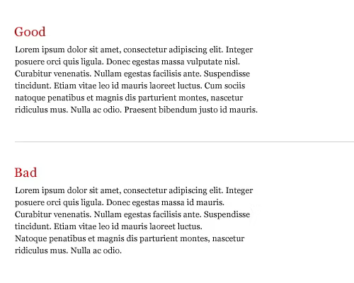
- Look for standalone words at the end of line breaks and remove them as they break the visual flow of elements.
- Check if your line lengths are consistent, so the lack of uniformity doesn't throw viewers off.
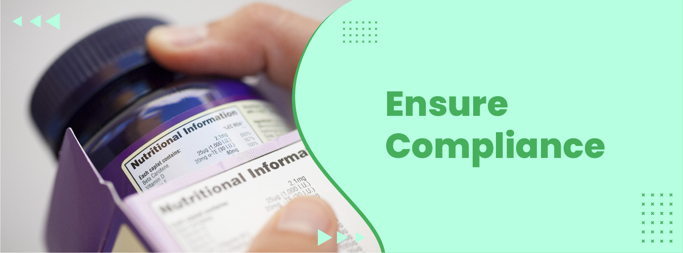
2. Ensure Compliance
The FDA has strict requirements for the placement of information, font size, type, spacing, etc., to make sure consumers can see important information clearly.
If you don’t adhere to these requirements, you might have to face product recalls or end up with a “misbranded” label. So, here are a few things you should look out for to maintain compliance:
- Make sure mandatory label statements like product identity, quantity declaration, ingredient declaration, etc., are placed properly and adhere to FDA’s recommended font size and style.
- Check for sufficient contrast between the background and font, and ensure that there are no obscuring vignettes or graphics on the mandatory label statements.
- Lastly, ensure that the margins and text are spaced properly. These sizes vary depending on your label size, and you can find more information on labeling requirements on our resources page.
To avoid label compliance issues, here’s what you can do:
- Create custom checklists with the placement of information, font size, spacing requirements, etc., to ensure nothing slips through the cracks. You can download FREE checklists from the resource section or use our label management tool and create a workflow with custom checklists.
- Use our free font finder to check the font type and the free online measurement scale to ensure you’ve got the right font size and spacing.
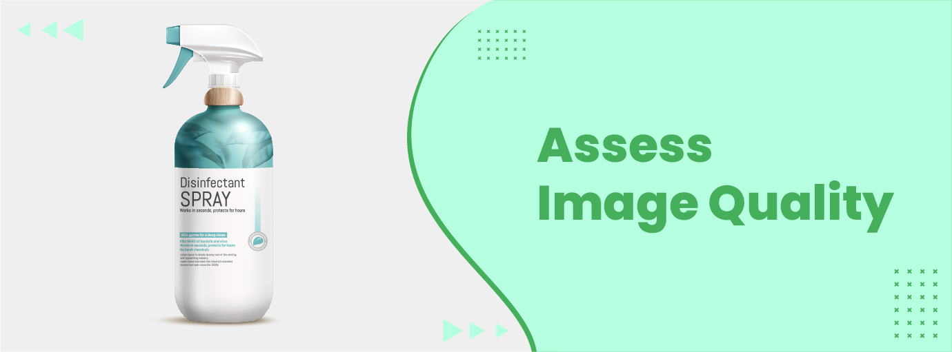
3. Assess Image Quality
Creating label artworks with high PPIs (Pixels-Per-Inch) makes your labels crisp, adds depth, and improves the overall print quality. That’s why most printers request that your label artworks be at least 300 PPI.
However, this doesn’t mean that higher DPIs mean more lifelike images and more sales. This is because the human eye can’t tell the difference between images that are 300 DPI and 600 PPI even under magnification. Plus, images with higher PPI will cause your printer’s systems to crash and cause lags in the printing process.
In short, you must ensure that your artwork’s PPI doesn’t exceed 300, and here’s how you can do that on different mediums:
- If you’re using Photoshop, click “Image” and choose “Image Resolution” to check the artwork’s resolution.
- In case you’re using Acrobat, or any other image viewer to check your artwork’s resolution, set the zoom to 300% and check if the image appears pixelated. Your label has the right resolution if the image isn't pixelated.
- If you’re using Windows, you can check the DPI of the artwork file from the “Details” tab in the Properties window. And Mac users can select the “Show Inspector” tool from the Preview window to check your artwork’s PPI.
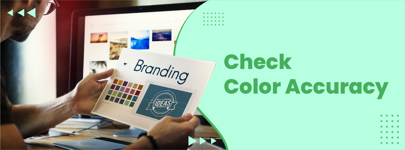
4. Check Color Accuracy
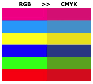
The colors you see on your computer screen aren’t identical to the printed label, as your screen uses light to make colors (RGB), and the colors on labels are made from ink (CMYK).
So, color proofing your labels is important to maintain color consistency and accuracy across all of them. Here are a few things you can do to check if the printed labels will match the colors on the screen.
- Use Artwork Flow's pantone color finder to check for color consistency. This tool detects the CMYK and Pantone colors used in your artwork and helps control printing costs and color consistency.
- Always ensure that color proofing is turned on when designing labels, so you’ve got a fair idea of what your product label will look like once printed and avoid costly printing errors.
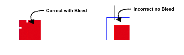
5. Ensure The Label Has The Right Bleed Area
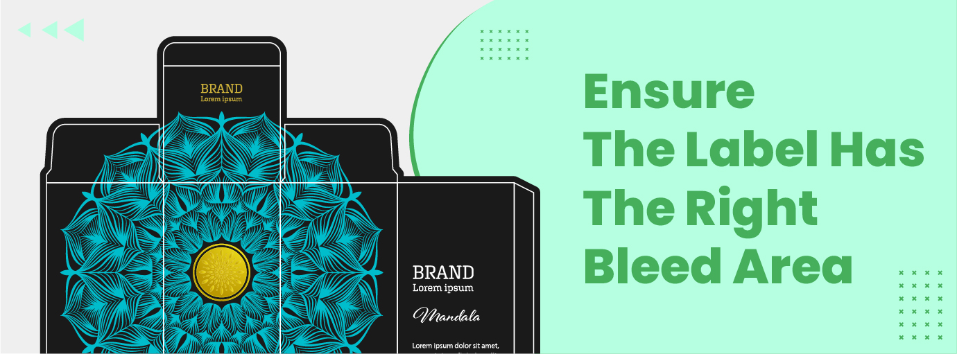
While printing labels, you must set a bleed area to prevent unwanted white borders, potential smudging from paper movement and ensure that images don’t get cut off during the process.
Labels usually have a bleed area of about 0.125” (3mm) or 0.25” (6mm) on both sides, but if you’re not sure how much bleed to add, consult your printers.
Also, here are three things you must check to ensure the printed label doesn’t have uneven margins and slanted white spaces that ruin its appearance.
- Using Artwork Flow's online scale, check if the printer's trim marks are set at the right size.
- Add a safe zone to ensure that important text and graphics aren’t cut off even if the label sheets shift or get misaligned during printing. Again, use Artwork Flow’s online measurement scale to check if the safe zone is sufficiently large.
- Make sure graphics, logos, and text don’t extend beyond the bleed area, so they don’t appear cut off.
Wrapping Up
Proofing your labels is important, as a label with missing information, inconsistent colors, and spelling mistakes causes a dip in brand credibility. This is because consumers might mistake your products for counterfeit ones, and it also causes potential issues such as product recalls and fines from agencies like the FDA. Utilizing brand compliance software can help mitigate these risks by ensuring accurate and compliant label content.
You can use Artwork Flow's proofing tool, font finder tool, color extractor tool, artwork compare tool, etc., to catch major errors like spelling, font size, placement, and image quality errors.
And if you want to optimize your workflow and ensure your quality checks at every stage with custom checklists, check out Artwork Flow!


%20(1).png)


